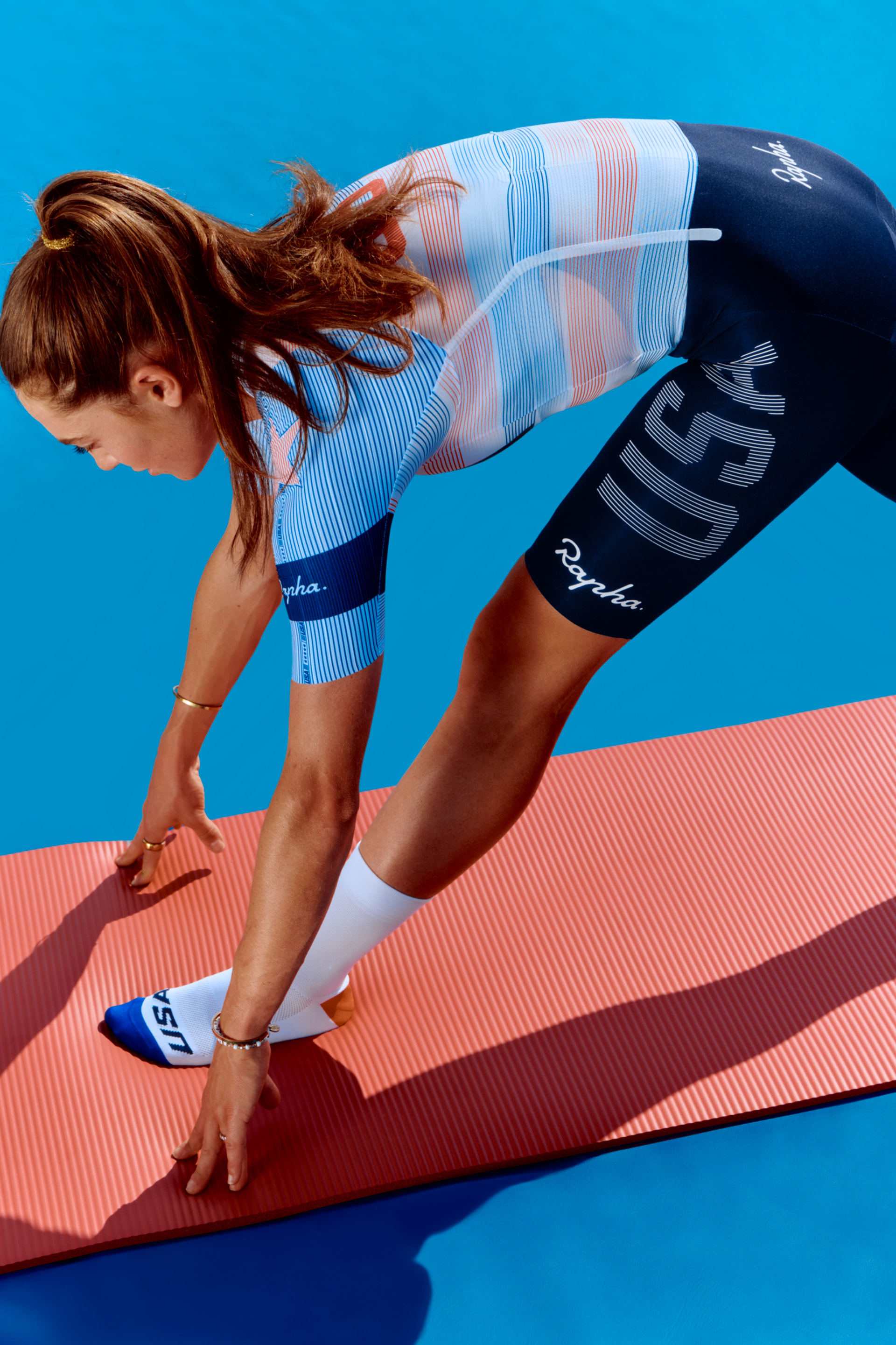
Anyone else see the Team USA Olympic jersey preview from Rapha? Personally, I would have expected a much better design effort. something which honors the historic design with a classy update. What Rapha has created is simply ugly to my eye.
6 Likes
That “light red” looks orange in the photos I’ve seen. Not impressed.
3 Likes
Agree. Very, very underwhelmed. Doesn’t even come off as red, white, and blue to the eye. I was going to buy a couple to get the nice treatment from cars but not sure if I can bring myself to now.
5 Likes
It doesn’t even remotely evoke anything American and is a complete failure as a Team USA jersey. As a weary Canadian, I love it! ![]()
23 Likes
I am neither overwhelmed or underwhelmed… I am whelmed.
7 Likes
Wasn’t the jersey in last year’s worlds just black and white?
It slaps. Great national team kit.
18 Likes
I dig it. It’s a great design. As a bonus, it doesn’t have that loud or in your face vibe, which is a welcome change from the vibe my country is inflicting on the world right now.
37 Likes


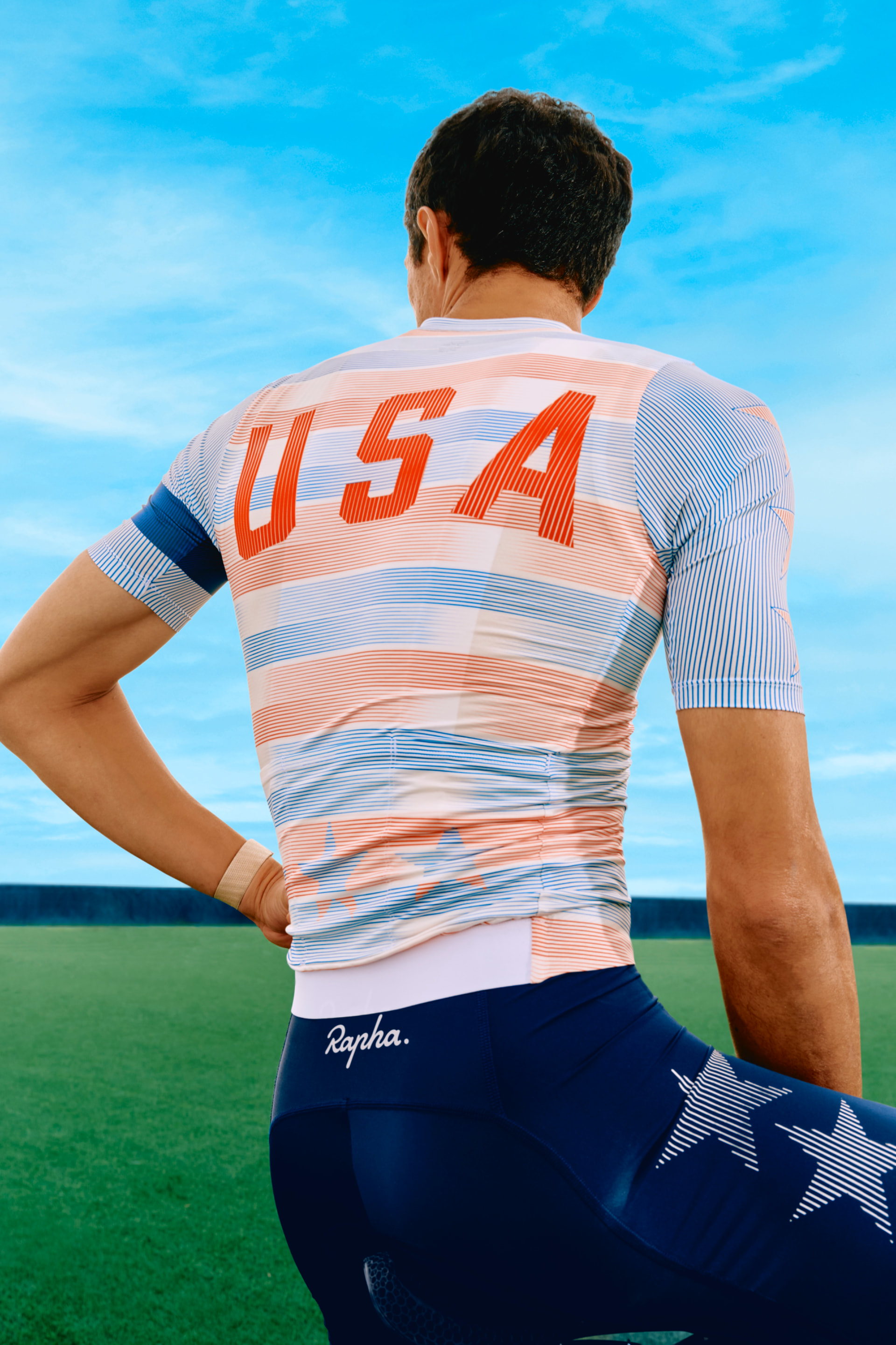
I LOVE it, so much better than the previously antique design. This is a modern kit
21 Likes
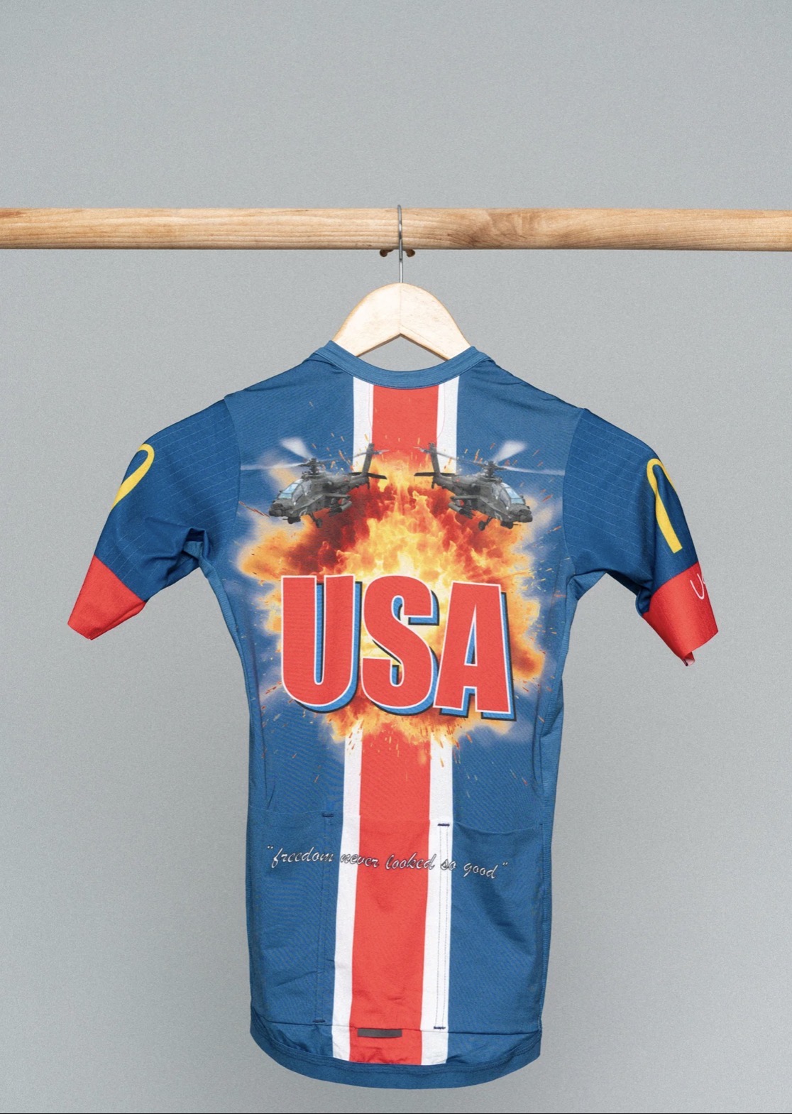
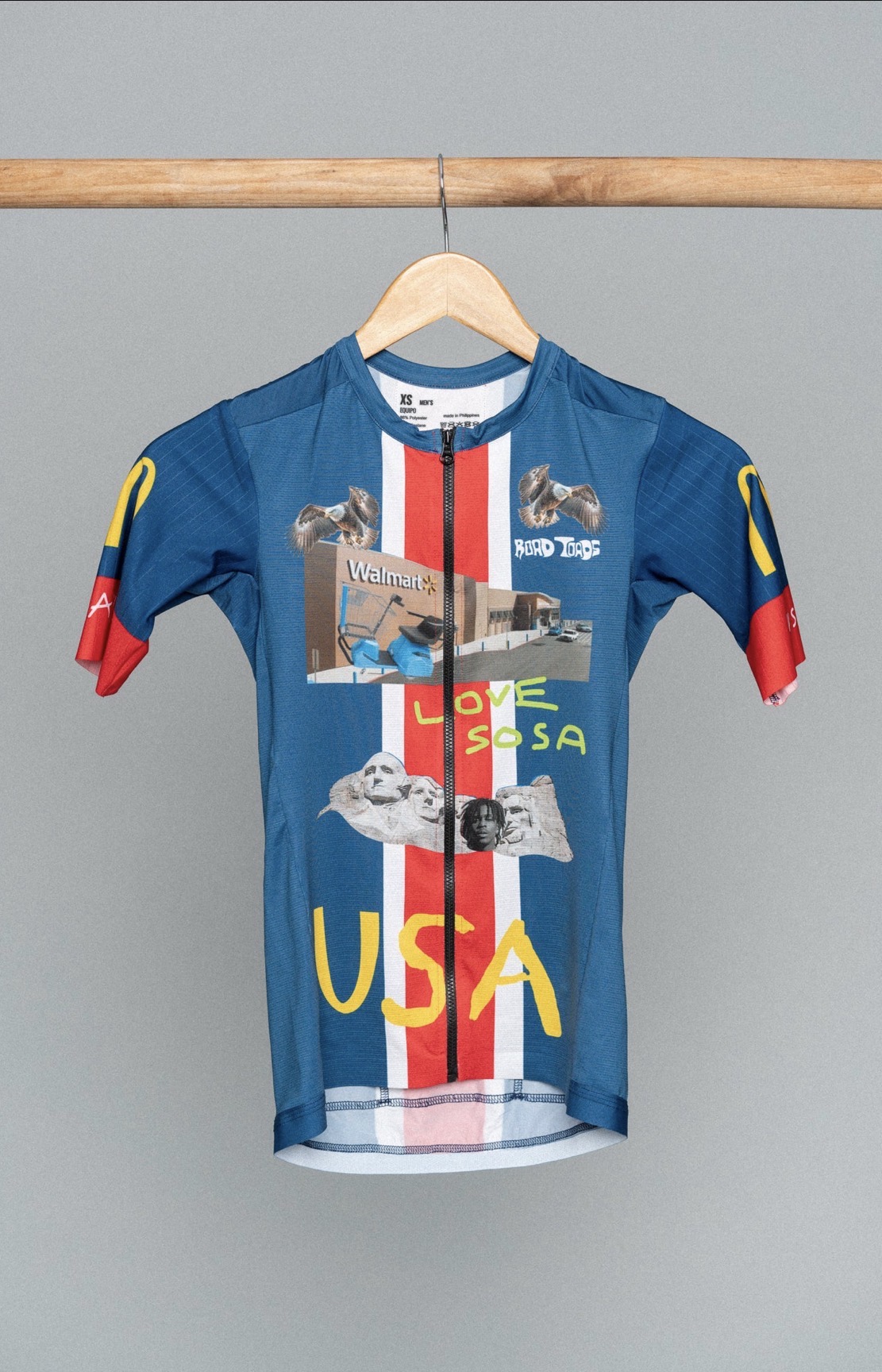
I’d do a overloaded trump design, probably put his mouth right on the crotch, the only problem is, satire is lost on some people
4 Likes
24 Likes
It’s a great looking design. But not as a USA national kit.
1 Like
I like it.
4 Likes
Lol. We should have an Idiocracy version.
2 Likes
Essence of America. Captured so well ![]()
Finally. A beautiful design for USA. It’s shockingly not gaudy for a change. This is not meant to sound unpatriotic, but Stars and Stripes in their full-color glory don’t usually make for something that’s attractive.
20 Likes
Personally think it looks great. Bit of a nod to the Orange, White and Blue that is the current USA. Having said that I’d have preferred that they commission Road Toad to design it, that’d have been a banger.
10 Likes
It’s growing on me. We could use more subtlety around here.
16 Likes
I think it’s sharp and may be interested in wearing it, but not really a great time of national pride right now IMO.
5 Likes